Whether you are a marketing specialist who spends entire days bogged down in hundreds of emails or a casual user who sends merely one mail a month, you participate in a growing trend.
Nowadays, emails have become a staple of online communication, with over 300 billion emails landing daily in countless inboxes around the world. And nothing suggests this number will decrease in the foreseeable future.
On the contrary, despite the growing popularity of chat apps, messengers, and social media, emails are projected to remain a prevalent method of exchanging messages.
Consequently, mastering the art of crafting an engaging and easy-to-read email also grows in importance.
One of the often overlooked aspects of creating outstanding emails is selecting an appropriate font. While it may sound overly dramatic, your font choice can be the difference between flawlessly conveying your message and never hearing back from your recipient.
After all, not many people would reply to an email full of incomprehensible characters.
Here’s an in-depth guide on the best email fonts to help you supercharge your email marketing campaigns.
First, it’s worth taking a little detour to provide some context for the following discussion.
Generally speaking, one could separate all the existing fonts into two categories:
The first group is characterized by being full of niche fonts. Still, some fonts from this category, such as Google’s Roboto Bold and Open Sans, enjoy quite a high renown.
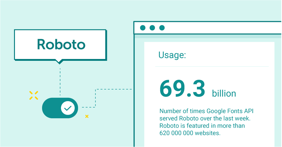
Source: https://fonts.google.com/specimen/Roboto/about
These fonts exist on the web, meaning they are not inherently a part of any operating system. As a result, there is no guarantee the intended font will display in the recipient’s email.
If the font is incompatible with the recipient’s mailbox provider, they will see a default font or a collection of hard-to-understand symbols in its place. Ultimately, it could ruin your chances of securing a conversion.
The second group is abundant in well-known fonts like Arial and Times New Roman. Besides being called web-safe fonts, they are known as standard, cross-platform, or system fonts. The reason for it is simple — they are widely supported across the most popular devices and email clients.
They are also frequently referred to as email-safe fonts since they are compatible with most email services.
If you want to be sure your email looks just how you want it to, using a web-safe font is the best course of action. That being said, not everyone is fond of this solution.
Maximize your email deliverability and security with EmailLabs!
Although web-safe fonts (as the name suggests) are generally safer to use than web fonts, they are significantly more restricting than their counterparts. With a limited number of options, they make it virtually impossible to stand out from other brands. It can be a problem if you have a distinct vision you want to bring to life through your marketing.
Web fonts are an entirely different story. What they lack in accessibility, they make up in originality.
A specific web font might be ideal if you know what fonts your recipients’ email providers support. This way, you can craft an irresistible email pitch with the help of a font that perfectly encapsulates the spirit of your business.
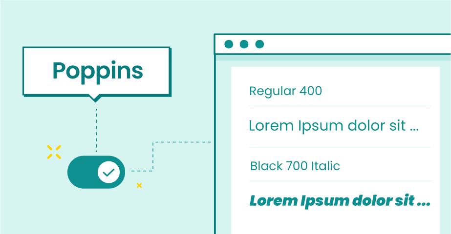
For example, a font like Poppins (presented below) can help you communicate your message more efficiently.
Nonetheless, beware of using web fonts willy-nilly. Not every web font will load in your recipients’ email inboxes. For instance, Gmail supports Open Sans and Roboto web fonts, but your recipients using Outlook and Apple Mail will not see them in their emails.
To solve this issue, you could specify a fallback font that will be displayed if anything goes wrong. It is a safety net that can prevent your email from being immediately discarded.
On top of that, each email provider will default your text to a fallback font if it cannot recognize the font you used in your email. Gmail’s default font is Arial, Apple Mail uses Helvetica, and Outlook uses Calibri.
A word of caution, though. While it can prevent your email from turning into a mess, relying on a fallback font is far from ideal. It can affect your emails’ layout, legibility, and overall design.
Another alternative is to use the desired web font in an image. Yet, it also comes with a set of issues. Since emails composed entirely of images might take too long to load or be inaccessible to screen readers, you should use this option only for small pieces of text.
With that out of the way, it is finally time to look more closely into the fonts you should consider for your emails. Learning about font families is an excellent first step toward achieving this goal.
There are five families, or types, of fonts:
Let’s examine them one by one.
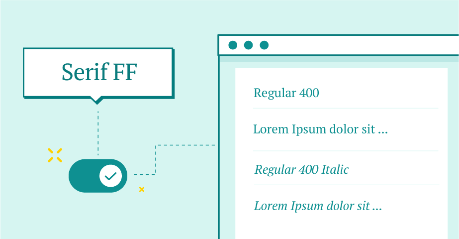
Serif Font Family
These little strokes that you can see at the end of the letters above are the defining feature of fonts called serif typefaces.
Serif fonts have been in use for hundreds of years, predominantly in body text. They are a bit unimaginative yet timeless choices for emails.
Times New Roman is one of the most popular serif fonts. Commissioned by the British newspaper The Times in 1931, it took the market by storm almost immediately after its commercial release.
Companies using serif fonts in their logos include Tiffany & Co. and Vogue.
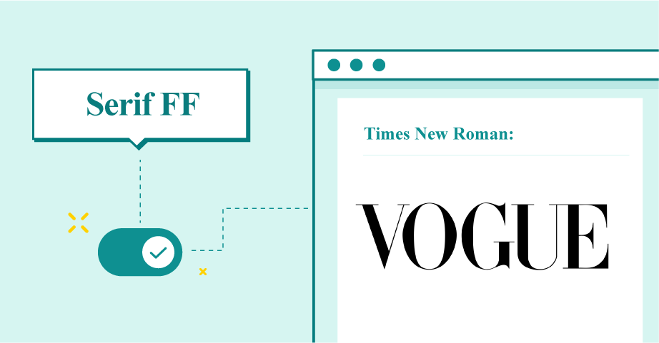
Serif font was used in Vogue’s brand logos, among others.
Using a serif typeface in your emails can make your brand look more professional. It gives a formal appearance while being space-efficient and effortlessly legible. At the end of the day, classics are classics for a reason.
The sans serif typeface sits on the opposite end of the spectrum. Its lack of strokes at the end of letters and symbols gives off a more modern look.
Popular sans serif fonts include Arial, Helvetica, Calibri, and Verdana. The Comic Sans font also belongs to this group, although it is considered the black sheep of the family.
A subscription-based streaming service Netflix includes a sans serif font in its logo.
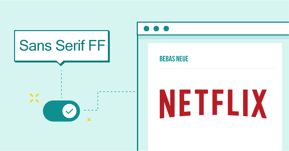
Sans Serif Font Family was used in Netflix’s brand logos, among others.
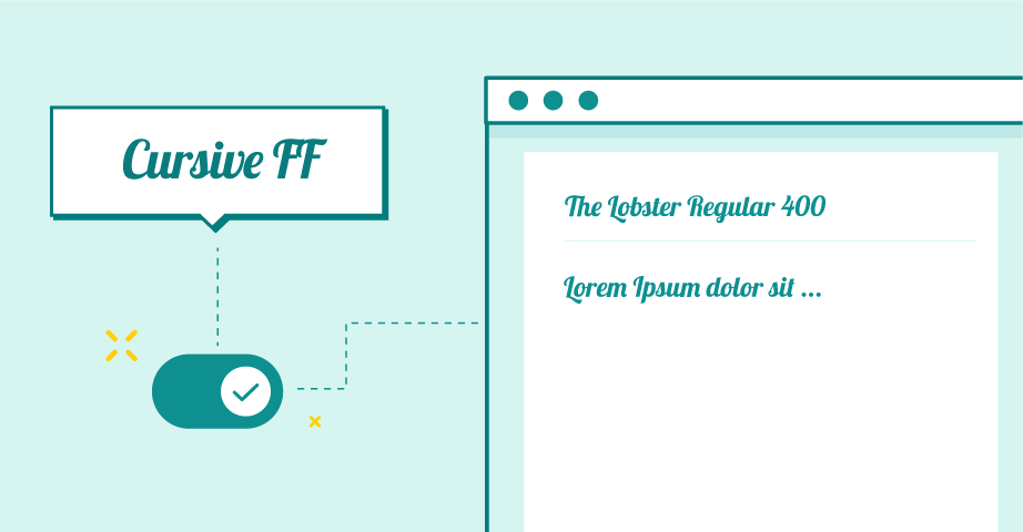
Cursive Font Family
Cursive fonts, also known as script fonts, present a unique take on representing digital text. These fonts mimic human handwriting, aiming to achieve a more natural effect than other fonts. Therefore, a script font can work exceptionally well for signatures.
Other than that, you are probably better off staying away from these font styles. While they can be an outstanding choice for a company logo, script fonts work poorly as email fonts.
Examples of popular fonts from this family include Lobster, Lucida Handwriting, Edwardian Script, and Pacifico.
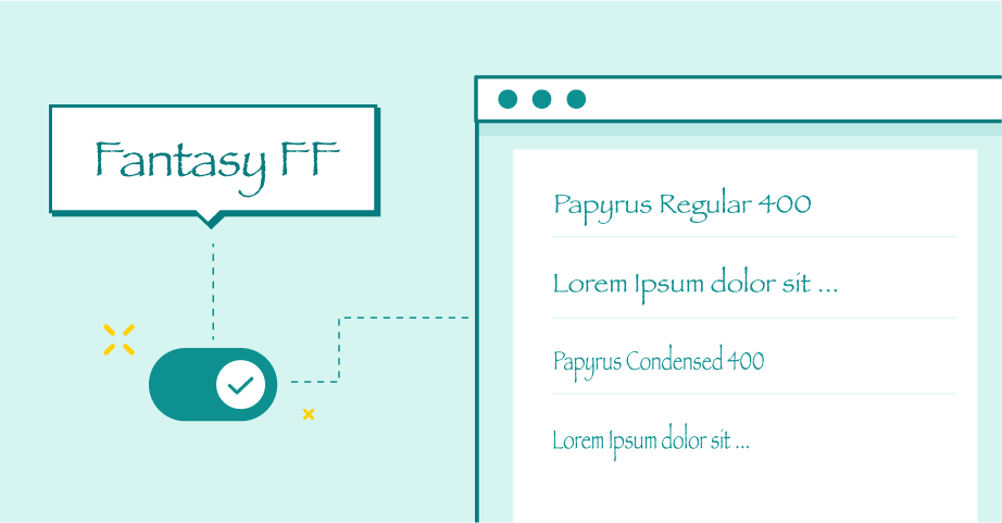
Fantasy Font Family
Fantasy, or decorative, fonts embody the idea of creativity without going completely off the rails. They work best as custom fonts for games and presentations.
Papyrus and Harrington are the standout examples in this category because both of them offer pretty good font legibility while adding a bit of distinctive charm.
As their name indicates, decorative fonts should be treated as a form of decoration. Thus, these fonts work best when used scarcely.
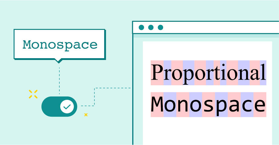
Comparison between monospace and proportional fonts.
source: https://en.wikipedia.org/wiki/Monospaced_font
The last in the long line of font families (or font categories) worth mentioning is the collection of fonts with fixed character widths. It means the space each letter occupies in the text is the same.
Many monospace fonts, such as Courier and Lucida Console, have a typewriter-like appearance. Because of that, they work best for writing movie scripts or typesetting computer code.
If you are set on using a monospace font in your email, you have your work cut out for you. Besides being unsupported by many email clients, these fonts tend to make characters blend together.
You will have to experiment with your email design to resolve this issue. For instance, without adjusting the line spacing and font size of your body text, your content can be hard to read.
Maximize your email deliverability and security with EmailLabs!
After learning about email font categories, let’s immerse ourselves in the world of the best email fonts.
Selecting the right font for your email campaigns can be a tough row to hoe, from addressing general concerns (Should I go with the sans font family or not?) to determining minor yet relevant details (What font style and font size should I choose?).
Nevertheless, the task is more doable than many people think. A few email fonts stand out in this regard, boasting fantastic designs that work for a wide range of purposes.
Here are the best fonts for emails that will not let you down.
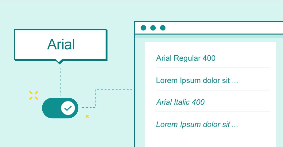
The Arial Font
The Arial font is the epitome of minimalism. It is one of the best examples of modern fonts that are highly legible and versatile. Like all sans serifs, it is ideal for all sorts of screens, from mobile devices to laptops.
Its soft and full curves make Arial a popular choice for publishing web content. If you have ever encountered a default font, it was most likely Arial.
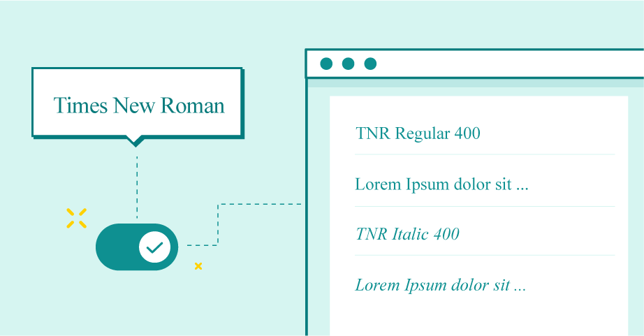
The Times New Roman Font
Another welcome choice for an email font, Times New Roman oozes an aura of tradition and authority. Often the default font choice in word processing programs, it is a serif font that has proven its usefulness time and time again.
As one of the best email-safe fonts, it sees frequent use by marketers. It works particularly well in headers and official documents.
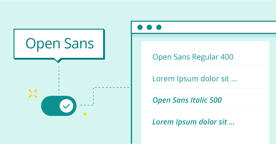
The Open Sans Font
The Open Sans font has a neutral, friendly look. Gmail officially supports it. Consequently, it will show up in most of your recipients’ inboxes.
Google commissioned this web font in 2010, with its primary purpose being to display digital content. As such, it is well-optimized for web and mobile interfaces.
It is a legible sans serif font that works well for emails. Whether you want to include it in the body text or heading, it will do its job flawlessly.
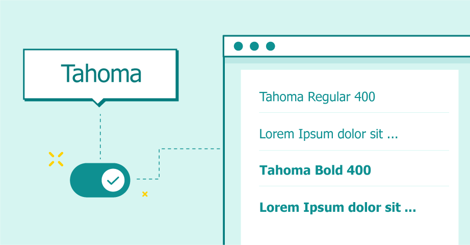
The Tahoma Font
This Microsoft-designed font is supported by most email clients and for a good reason. In terms of legibility, it has no equal.
Thanks to the similar length in its upper and lower case letters, Tahoma is one of the best fonts for on-screen use. It is a web-safe font that can help you make your message pop.
This email font option provides clarity at even smaller font sizes, which translates well to emails’ inherently limited nature.
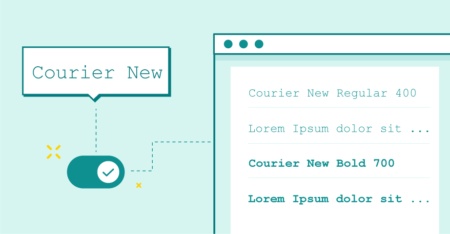
The Courier New Font
A modern take on one of the most popular monospace fonts, Courier New delivers impressive legibility while maintaining the character of the original. Its easy-to-read serifs make it an excellent choice for an email font if you want to serve your readers a blast from the past.
As one of the most original web fonts around, it is perfect for a branded newsletter — a worthwhile option if you go for a more rustic or old-school vibe.
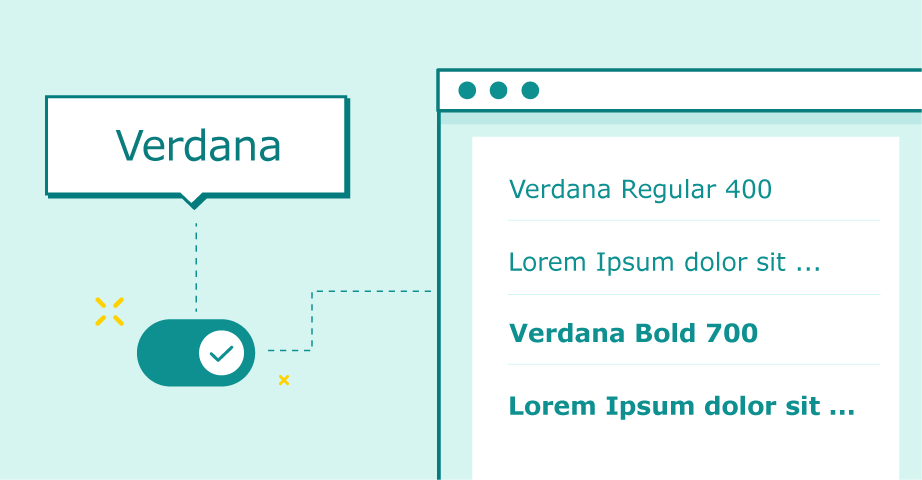
The Verdana Font
Verdana, designed by Matthew Carter, is a sans serif typeface that was explicitly created to address the challenges of on-screen display. And it does just that.
Whether you prefer reading on a computer screen or using mobile devices to catch up with the latest news, Verdana is your best friend. Its simplicity and high readability are outstanding qualities that make it a good choice for an email font.
If you are looking for a font that can give your email marketing campaign a touch of classical elegance without making it look tacky, try it out!
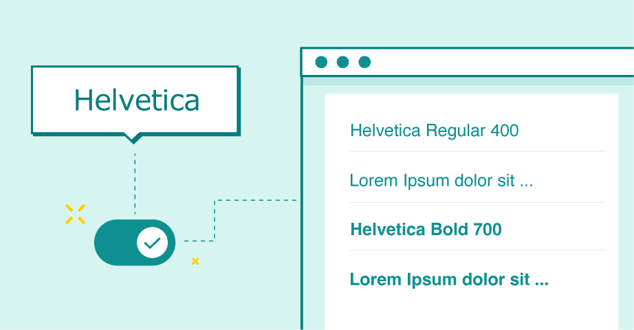
The Helvetica Font
Another popular choice, Helvetica, amazes with its sleek and easily approachable design. It is a neutral typeface that offers excellent clarity.
You can easily recognize this font by its unusually tight spacing between letters, which gives the text a dense look.
While there are better choices for body text, Helvetica can do wonders in slogans, headlines, and titles. Use it right, and your email marketing campaigns might become even more successful!
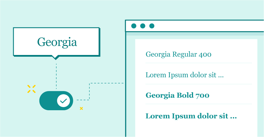
The Georgia Font
If you require a font that is formal yet versatile, Georgia is the right font for the job. It is a serif font that works with most email clients and suits various types of messages. You can even find it on some lists of default fonts.
Georgia’s wide-spaced letters can help readers follow the text, especially if your content is more word-heavy. At the same time, a reasonable variance between the regular and the bold font style be beneficial for added emphasis.
Georgia also makes for a pretty good fallback font. Overall, it has all the necessary qualities that you can find among email-safe fonts.
Maximize your email deliverability and security with EmailLabs!
You must consider numerous factors when searching for the ultimate email font that will make your recipients fall in love with your messages.
Besides deciding whether you want to opt for a serif or a sans serif font, you also need to select the proper font size and font style, determine if you will use the same font for both header and body and think about the font alignment.
Here are a few helpful pointers that can make this process more manageable.
Sacrificing readability for creativity might earn you some style points but will most likely result in disgruntled recipients.
Clarity and readability are the attributes that play the most prominent role both in print and digital media. Thus, no matter how much you like using bold and italic font styles, it would be best if you used them sporadically.
The same goes for using more than two font colours in your email. Otherwise, your readers can have difficulties reading the text, closing the text before they get to your meticulously crafted CTAs.
For some font choices, increasing font size or using bold might be beneficial. However, these are in the minority.
When in doubt, avoid the worst font styles and stick to time-tested options.
It may sound contradictive, but experimenting with various email fonts may yield marvellous results — provided you use the best email fonts from our list and not a custom font with an unusual line spacing.
Using a sans serif font like Helvetica for your title and a serif font like Times New Roman for body text might be just what you need.
Alternatively, you could visit Google Fonts and add web fonts that work well with your favourite options. Many email-safe fonts can look even better when accompanied by web fonts.
When going this route, beware of using too many fonts, as it can make your email readability plummet. Instead of using multiple fonts in your email, it is best to limit yourself to two different fonts that complement each other.
Finding two different fonts that work exceptionally well together can make crafting your email campaigns much more manageable. Eventually, it can help you strengthen your brand and engagement simultaneously, taking your email marketing efforts to the next level.
So, you’ve browsed through all the best fonts for email and chosen the most suitable web font for your brand. Great!
Still, you cannot make do without some testing.
Sending yourself test emails can help you ensure everything looks fine from the recipient’s standpoint. For example, you can create accounts on various email clients (both web and mobile), including Gmail and Outlook, to see how the web font you chose performs in action.
If the email font looks messy or fails to load, reconsider using it for the real deal.
On the other hand, if everything seems fine, you can go ahead and start using this web font for upcoming email campaigns.
While sometimes wildly different from one another, the best fonts for email have one thing in common — they encourage readers to take action. This is why choosing the wrong email font can negatively affect your conversions, reducing your bottom line.
To ensure your email marketing remains a force to be reckoned with, pay attention to the fonts you use. Once you pick the best font for your business and use it extensively throughout marketing materials, this decision can help your company reach new heights.
Whether you opt for one of the free fonts or pay for a more suitable alternative, follow the advice above. Doing so will allow you to create more personalized emails, converting potential customers into buyers.

Head of Marketing
As an Enterprise B2B Marketing Manager with a background in the email deliverability industry, I bring experience in crafting marketing strategies that boost engagement rates and optimize performance for large-scale enterprises. My expertise lies in merging data-driven insights with innovative marketing techniques to ensure that every campaign not only reaches its intended audience but also engages and converts. 🎯 In private - love animals more.. than everything. :)
See more articles
We live in a world where your customers switch seamlessly between laptops, smartphones, and tablets. They navigate a complex digital ecosystem – checking emails, using mobile apps, and reacting...

We are delighted to announce that Vercom S.A., the company behind the EmailLabs project, has successfully completed the ISO 22301 certification process. This significant achievement underscores our commitment to...

EmailLabs, as part of the Vercom group, proudly announces its full commitment to aligning its ICT services with the latest cybersecurity standards. In response to dynamically changing regulations, the...
We are pleased to announce that MessageFlow, a product from the Vercom S.A. group, has received the prestigious CSA (Certified Senders Alliance) Certification. This recognition not only underscores the...
Compliance & Security, Email Marketing, Security
TL;DR DMARCbis is now official: After years of work by the IETF working group, the DMARC specification has been formally updated. Three new documents, RFC 9989, RFC 9990, and...

Email Marketing, Gmail, New feature
TL;DR Gmail Live: a new feature enabling natural language voice search in the inbox, powered by the Gemini model. AI Inbox and AI Overviews: a revamped inbox interface featuring...
Best practices, Best practices, Email Authentication
TL;DR: Strategic Takeaways for C-Level and Marketing Leaders DKIM2 is not a minor DNS configuration update. It is a systemic response to two critical business problems: Replay attacks: scenarios...
Compliance & Security, Email Marketing, Security
TL;DR DMARCbis is now official: After years of work by the IETF working group, the DMARC specification has been formally updated. Three new documents, RFC 9989, RFC 9990, and...
Email Marketing, Gmail, New feature
TL;DR Gmail Live: a new feature enabling natural language voice search in the inbox, powered by the Gemini model. AI Inbox and AI Overviews: a revamped inbox interface featuring...
Best practices, Best practices, Email Authentication
TL;DR: Strategic Takeaways for C-Level and Marketing Leaders DKIM2 is not a minor DNS configuration update. It is a systemic response to two critical business problems: Replay attacks: scenarios...
AI, Antispam, Best practices, Deliverability
C-Level TL;DR: Strategic Takeaways Recipient consent as a foundation (Item 0): Sending email messages without explicit recipient consent (opt-in) poses a significant risk to your sending infrastructure. Attempting to...
AI, Antispam, Best practices, Deliverability
Executive TL;DR: Strategic Takeaways Deliverability Schism: The growing divide between sales automation technologies and the security standards enforced by major global mailbox providers (collectively referred to as MAGY) is...

Modern email systems no longer treat the primary inbox as the default destination for every message. The final classification of an email is the result of a multistage evaluation...
Best practices, Maile marketingowe, Marketing E-mails, Transactional Emails
Mass email sending is a critical strategy for business owners, marketers, developers, and nonprofit managers looking to scale their outreach. Whether you are announcing a new product feature, distributing...

Best practices, Marketing E-mails
Customer feedback is the fuel for business growth, but gathering it effectively requires more than just a list of questions. Survey emails remain the most direct channel for understanding...

Best practices, Email Marketing, Pytania i odpowiedzi
Mail merge combines a template document with data to create personalized communications. This technique saves time by automatically generating individualized letters, emails, and labels without manual entry. What Is...

