Email Marketing, Maile transakcyjne, Transactional Emails
Email Marketing, Maile transakcyjne, Transactional Emails
In the age of digital communication, customers crave seamless, personalized experiences that make them feel valued and connected to the brands they love. Crafting the perfect confirmation email is an art that goes beyond merely confirming an order or booking. It’s an opportunity to reinforce your brand identity, build trust, and create lasting customer relationships.
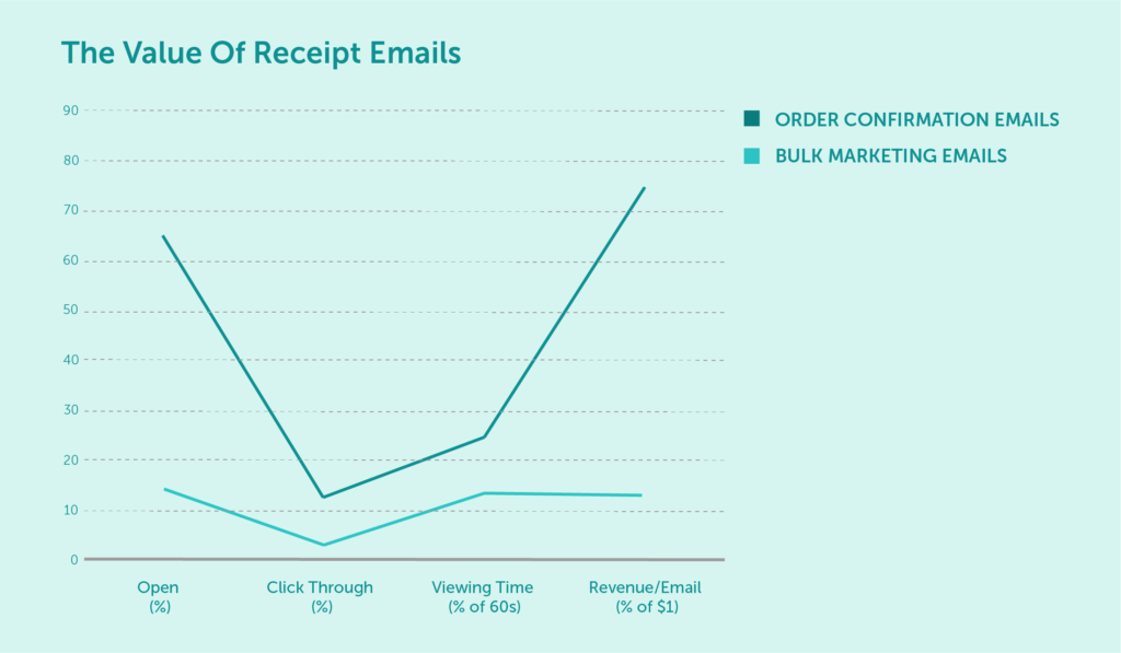
source: linkercloud.com
At the intersection of design, content, and technology, on-brand confirmation emails deliver vital information with a perfect touch of brand personality. These masterfully crafted messages combine essential confirmation email components such as the subject line, transaction details, brand voice, and visual elements to create a memorable and cohesive customer experience. When done right, they not only confirm the action taken but also evoke a sense of excitement and anticipation.
In this article, we’ll delve into the world of on-brand confirmation emails, providing you with real-life confirmation email examples and expert insights to elevate your email game. Read on to discover how to captivate your audience, nurture customer relationships, and strengthen your brand’s identity through expertly designed confirmation messages.
On-brand confirmation emails are the perfect blend of essential information and brand personality. By understanding their key components, you can create messages that resonate with your customers and leave a lasting impression. Let’s dive deeper into the anatomy of an effective confirmation email and explore various elements that contribute to its success.
The subject line of your confirmation email is the first thing your customers see after taking action. It should be concise, relevant, and make a lasting impression. Most importantly, it should clearly communicate the nature of the message and the action taken. Make sure to include the action (e.g., order confirmed, booking confirmed) and relevant details (e.g., product name, date, time).
A well-crafted email subject line should also reflect your brand’s tone of voice and evoke a sense of anticipation. For example, if you offer luxury products, you may want to use phrases such as “Your Experience Awaits.” For a kids’ entertainment provider, something like “Ready to Play?” could be used.
The confirmation details are the core of a confirmation email. Whether it’s an order confirmation, registration confirmation, or payment confirmation email, be sure to include all relevant information. This may consist of order numbers, items purchased, event dates, and booking details. Clarity and transparency are key to ensuring that customers have all the information they need at their fingertips.
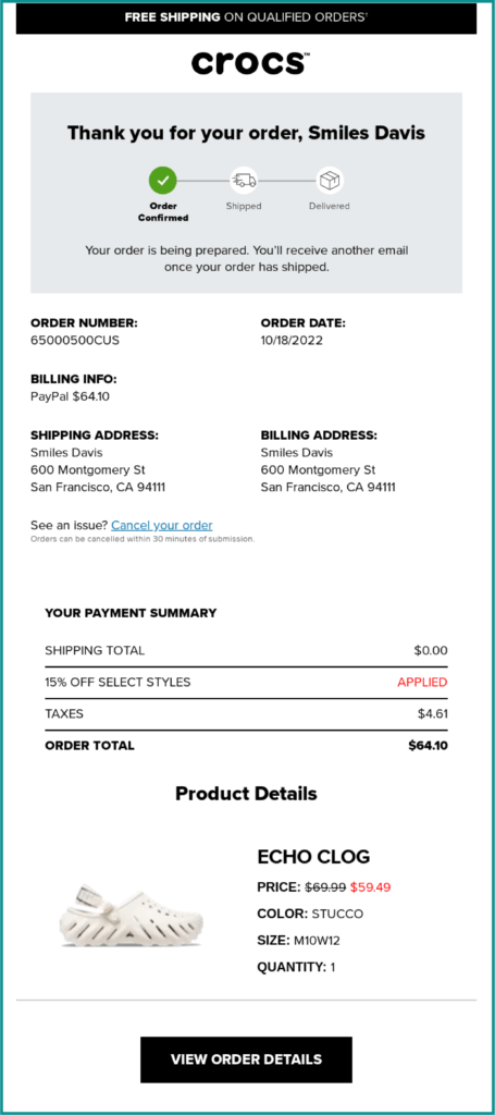
Source: https://reallygoodemails.com/emails/we-got-your-order-you-have-great-taste
This purchase confirmation email from Crocs is a perfect example of this. Indeed, it may not be the most visually stunning order confirmation email template out there, but it lists all the relevant data and helps provide customers with a sense of assurance – shipping information, billing address, and payment method. On top of that, it gives the customer an option to cancel or modify their order.
Maximize your email deliverability and security with EmailLabs!
Your brand voice should be consistent throughout all communication channels, including confirmation emails. By maintaining a consistent tone, style, and language, you reinforce your brand identity and foster customer trust.
For example, a subscription confirmation email should reflect your brand’s personality, whether it’s playful, professional, or somewhere in between.
The conclusion of your confirmation email is an opportunity to add value by inviting customers to take further action. This could include upselling products, engaging in customer support, or offering a discount on their next purchase. A strong call to action is an effective way to drive customer engagement and create long-term loyalty.

Source: https://reallygoodemails.com/emails/confirming-your-cancellation-at-sinema
And so, even a cancellation confirmation email can be used to create a positive customer experience. A “Book a new table” button in an email about a cancelled reservation can encourage customers to return to your online reservation system the next time they’re looking for a table.
When designing your confirmation emails, you need to keep in mind the type of message you’re trying to send. Different actions require different messages, each with its own set of best practices.
Here are some of the most common types of confirmation emails.
Possibly the most common form of a confirmation email, the order confirmation message, is sent after a customer makes a purchase. It includes all relevant transaction details, such as product name, quantity, price, shipping information, and delivery date. Order confirmation emails usually also include a thank-you message and a call-to-action, such as signing up for the brand’s newsletter.

Source: https://reallygoodemails.com/emails/your-trade-order
Trade Coffee has nailed the order confirmation email design with a perfectly balanced blend of just the right amount of text and images. The clear product image, combined with the complete order summary, helps to reassure customers that their purchase has been successful. Below the data, the recipient can find additional help – FAQs, contact details, and social media links – all of which help to nurture the customer relationship.
A registration confirmation email does exactly what it says on the tin, it confirms a user’s registration on your website or app. It usually includes the account activation link – double opt-in helps to increase deliverability and ensure that the email address belongs to a real person. Registration confirmation emails also present an opportunity to welcome new users and encourage them to start using your product or service.
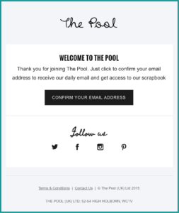
Source: https://reallygoodemails.com/emails/registration-confirmation-the-pool
This email from The Pool, a women’s online magazine, is a great example of a simple registration confirmation email template done right. It welcomes the new user, highlights the main features of the site, and includes a precise call-to-action – all within a few lines of text.
Payment confirmation emails are sent after a customer makes a payment, usually for an online purchase. It is safe to assume that they are the same as order confirmation emails. Yet, their importance should not be underestimated, as payment issues are one of the main reasons for shopping cart abandonment.
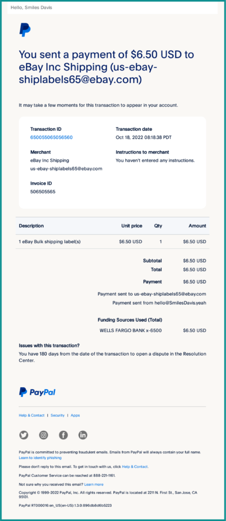
Source: https://reallygoodemails.com/emails/receipt-for-your-payment-to-ebay-inc-shipping
PayPal is a staple in the world of online payments, and its payment confirmation email design is as straightforward as it gets. The message includes all relevant transaction details, such as transaction ID, date, time, amount, and recipient. That’s all the customer needs to know that their payment has been successful.
A shipping confirmation email is sent after an order has been shipped or changed status. It informs the customer of their expected delivery date, usually with tracking information and a link to the shipping company’s website. Transactional emails often include a thank-you message and a call-to-action, such as signing up for a loyalty program or subscribing to the brand’s newsletter.

Source: https://reallygoodemails.com/emails/your-ag1-has-shipped
Athletic Greens uses a similar approach to Trade Coffee with its shipping confirmation email. It greets the reader with a short confirmation message followed by a “Track Order” button and the tracking number. Below, it contains a short message reassuring the customer that their decision to purchase from Athletic Greens was a good one.
Let’s group all system messages under one category, including password reset confirmation, two-factor login codes, and email change confirmation. These confirmation emails typically inform customers about an action that has been taken on their account, such as changing a password or email address. They also provide instructions on how to proceed if the customer did not initiate the action themselves.
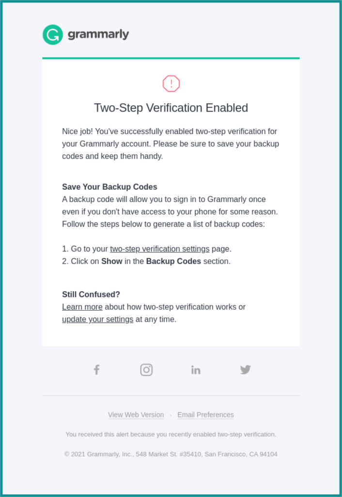
Source: https://reallygoodemails.com/emails/youve-successfully-enabled-two-step-verification
Grammarly keeps it short and sweet with its two-step verification confirmation email. The recipient is greeted with a friendly message and clear instructions on what to do next. The email also includes a helpful link to the company’s support center, should the customer need additional assistance.
Maximize your email deliverability and security with EmailLabs!
Now that we’ve explored the anatomy and types of confirmation emails, it’s time to get down to the nitty-gritty of crafting the perfect message.
Apart from the form of the message and its layout, there are a few other formal and technical requirements that are worth taking into account. The following tips will help you avoid common mistakes, create cohesive customer experiences, and deliver on-brand confirmation emails that delight your customers.
Arguably the most important aspect of confirmation emails is their technical foundation. By ensuring that your emails are properly coded and compliant with industry standards, you can avoid deliverability issues and improve customer engagement.
EmailLabs can help you with the backbone of your on-brand automated confirmation emails, providing you with an expertly managed email infrastructure focused on deliverability. Whether it is about sender reputation, DMARC implementation, or proper authentication methods, EmailLabs got you covered.
Yet, having even the best infrastructure is not enough. To ensure that your confirmation emails are properly delivered, you need to make sure that they are properly coded. This includes using HTML and CSS code that is compatible with all email clients, avoiding common spam words, and such.
Common technical considerations that you need to take into account include:
Visual elements are just as important as technical ones when it comes to creating on-brand confirmation emails. The overall look and feel of your message should be consistent with your communication strategy, helping you reinforce customer trust and loyalty. Here are some of the most important design considerations that you need to take into account when crafting your confirmation emails.
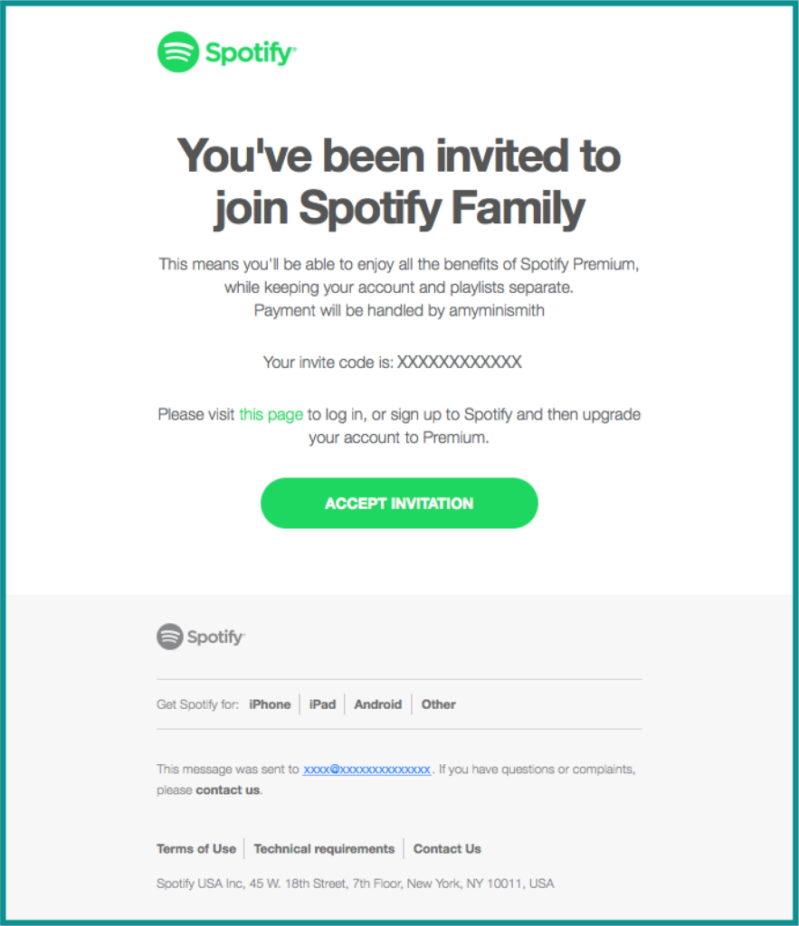
Source: https://reallygoodemails.com/emails/you-have-been-to-spotify-family
Spotify’s green is among the most recognizable brand colors out there. The company uses it throughout its website, apps, and marketing communications, and confirmation emails are no exception. This example uses a very simple layout, yet the green color in Spotify’s logo and other accents make it instantly recognizable.
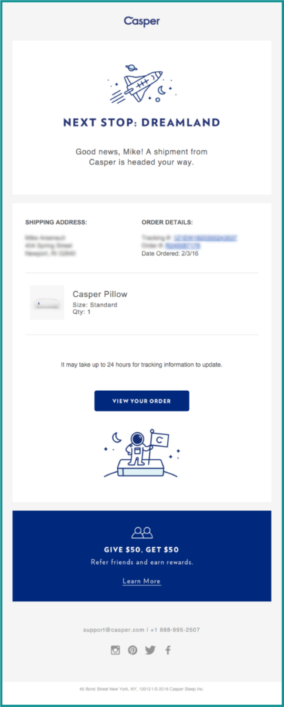
source: Pinterest
As mentioned above, you can have some exceptions and use a separate, more subdued email template for your confirmation messages. However, make sure that the basic look and feel of your brand is maintained.
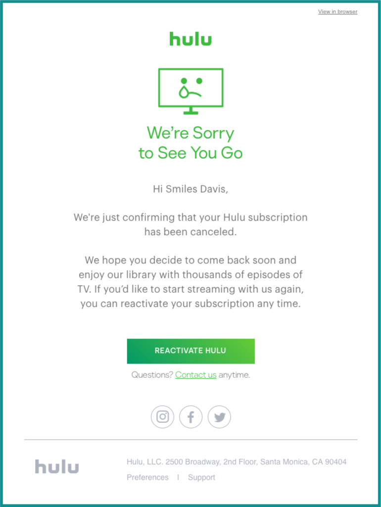
source: Pinterest
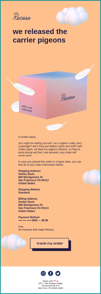
Source: https://reallygoodemails.com/emails/a-recess-shipment-from-order-69550-is-on-the-way
This order confirmation email from Recess is undoubtedly one of the most visually stunning confirmation messages out there. However, the email consists of only four images, excluding the social media buttons in the footer. This allows the email to load quickly, even on slower connections.
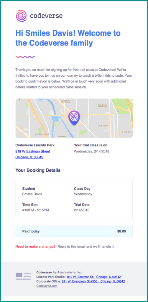
Source: https://reallygoodemails.com/emails/your-trial-booking-confirmation
Codeverse takes it easy – apart from the detailed free trial information below the headings, the personalization part of the email is kept to a reasonable minimum. Yet, it gives a much more human touch to the message than just a “Welcome to Codeverse.”
On-brand confirmation emails are the perfect blend of essential information and brand personality. They reinforce your brand identity, build trust, and create lasting customer relationships in a clear and intuitive manner.
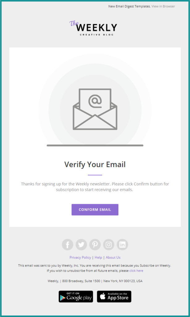
Source: Pinterest
When writing confirmation emails, be sure to check the confirmation email examples above and use a few best practices followed in them in your marketing messages. This will help you avoid common mistakes, create cohesive customer experiences, and deliver perfectly on-brand confirmation email templates.
EmailLabs can help you make your confirmation emails meet your customer expectations, providing you with expertly managed email infrastructure focused on deliverability. Contact us today to learn more about how we can help you take your email game to the next level.
We live in a world where your customers switch seamlessly between laptops, smartphones, and tablets. They navigate a complex digital ecosystem – checking emails, using mobile apps, and reacting...
We are delighted to announce that Vercom S.A., the company behind the EmailLabs project, has successfully completed the ISO 22301 certification process. This significant achievement underscores our commitment to...
EmailLabs, as part of the Vercom group, proudly announces its full commitment to aligning its ICT services with the latest cybersecurity standards. In response to dynamically changing regulations, the...
We are pleased to announce that MessageFlow, a product from the Vercom S.A. group, has received the prestigious CSA (Certified Senders Alliance) Certification. This recognition not only underscores the...
Modern email systems no longer treat the primary inbox as the default destination for every message. The final classification of an email is the result of a multistage evaluation...
Best practices, Maile marketingowe, Marketing E-mails, Transactional Emails
Mass email sending is a critical strategy for business owners, marketers, developers, and nonprofit managers looking to scale their outreach. Whether you are announcing a new product feature, distributing...
Best practices, Marketing E-mails
Customer feedback is the fuel for business growth, but gathering it effectively requires more than just a list of questions. Email surveys remain the most direct channel for understanding...
Best practices, Email Marketing, Pytania i odpowiedzi
Mail merge combines a template document with data to create personalized communications. This technique saves time by automatically generating individualized letters, emails, and labels without manual entry. What Is...
IT & Tech, Pytania i odpowiedzi, Technical
When an email travels from sender to recipient, it passes through several critical components of email infrastructure. At the heart of this journey sits the Mail Transfer Agent (MTA)...
Best practices, Deliverability, Google and Yahoo's Requirements, Pytania i odpowiedzi
The world of email marketing is constantly evolving, and leading mail service providers – Gmail, Yahoo, Microsoft, and Apple – regularly update their guidelines for senders. In recent years,...
Gmail, Google and Yahoo's Requirements
You might have noticed a new item in your Gmail sidebar recently – the “Manage subscriptions” tab, often flagged with a blue notification dot. While Google announced this feature...
IT & Tech, Pytania i odpowiedzi, Technical
Efficient email communication isn’t just about sending messages — it also involves integrating email functionality into your business systems and applications. Email APIs (Application Programming Interfaces) serve as the...
One of the most important yet often underestimated elements in shaping a company’s brand perception is the transactional email. In e-commerce, the design of such messages must be carefully...