Emails are powerful digital marketing tools for businesses of all sizes to connect with their audiences and drive conversions. However, creating a successful email marketing campaign is no easy task. With so many emails flooding inboxes every day, it’s crucial to stand out from the crowd and deliver content that resonates with your clients.
One way to achieve this is by studying and learning from the top email newsletters in the industry. By analyzing the strategies, design elements, and copywriting techniques used by successful brands, you can gain valuable insights and apply them to your own campaigns.
In this article, we’ve gathered a list of 8 email newsletter examples that you must open and learn from. Every newsletter example below showcases the best of the best, highlighting the latest trends and best practices in email marketing.
Whether you’re looking to improve your open rates, click-through rates, or overall engagement, these email newsletter examples are sure to inspire and inform your next email campaign.
Read on and discover the crème de la crème of email newsletters!
Maximize your email deliverability and security with EmailLabs!
An email newsletter is a regularly distributed email that is sent to a group of subscribers who have opted-in to receive it. Newsletters are used by individuals, businesses, and organizations to share information, promote products or services, and build relationships with their audience.
The purpose of a newsletter is to provide valuable and relevant content to subscribers while also keeping them updated on the latest news and events related to the sender.
Newsletters can be sent daily, weekly, bi-weekly, or monthly, depending on the frequency that the sender chooses. The content of a newsletter can vary from text-based articles and news updates to promotional graphics and videos, all designed to be visually appealing and easy to digest. Most newsletters tend to include links to social media platforms and other websites that the sender wants to direct traffic to.
It’s important to note that no matter how good your newsletter is, you won’t be able to maximize your returns if your email service provider is not up to par. You need a solution that is able to send large volumes of emails quickly and efficiently without sacrificing deliverability.
This is where EmailLabs comes in – our cutting-edge email delivery platform prioritizes speed, convenience, and security, ensuring that your email newsletters always reach the inbox.
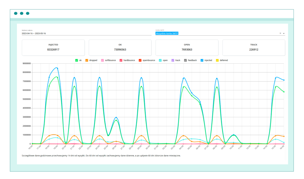
In the EmailLabs panel, you can monitor and analyze every email sent from your domain.
Try our services for free today and deliver your newsletter campaigns to inbox!
Virtually all organizations that want to compete in the digital age need to have an email newsletter, no matter if they provide eCommerce solutions or are simply a small content platform.
The reason for that is simple – email newsletters allow businesses and organizations to maintain consistent communication with their audience. Unlike social media platforms, where content can easily get lost in the shuffle, email newsletters allow senders to have direct access to the inbox of their subscribers. This means that the content of the newsletter is more likely to be seen and engaged with.
Email newsletters also provide an opportunity for businesses and organizations to build better relationships with their audience. By providing valuable and relevant content, subscribers are more likely to trust the sender and view them as an authority in their field.
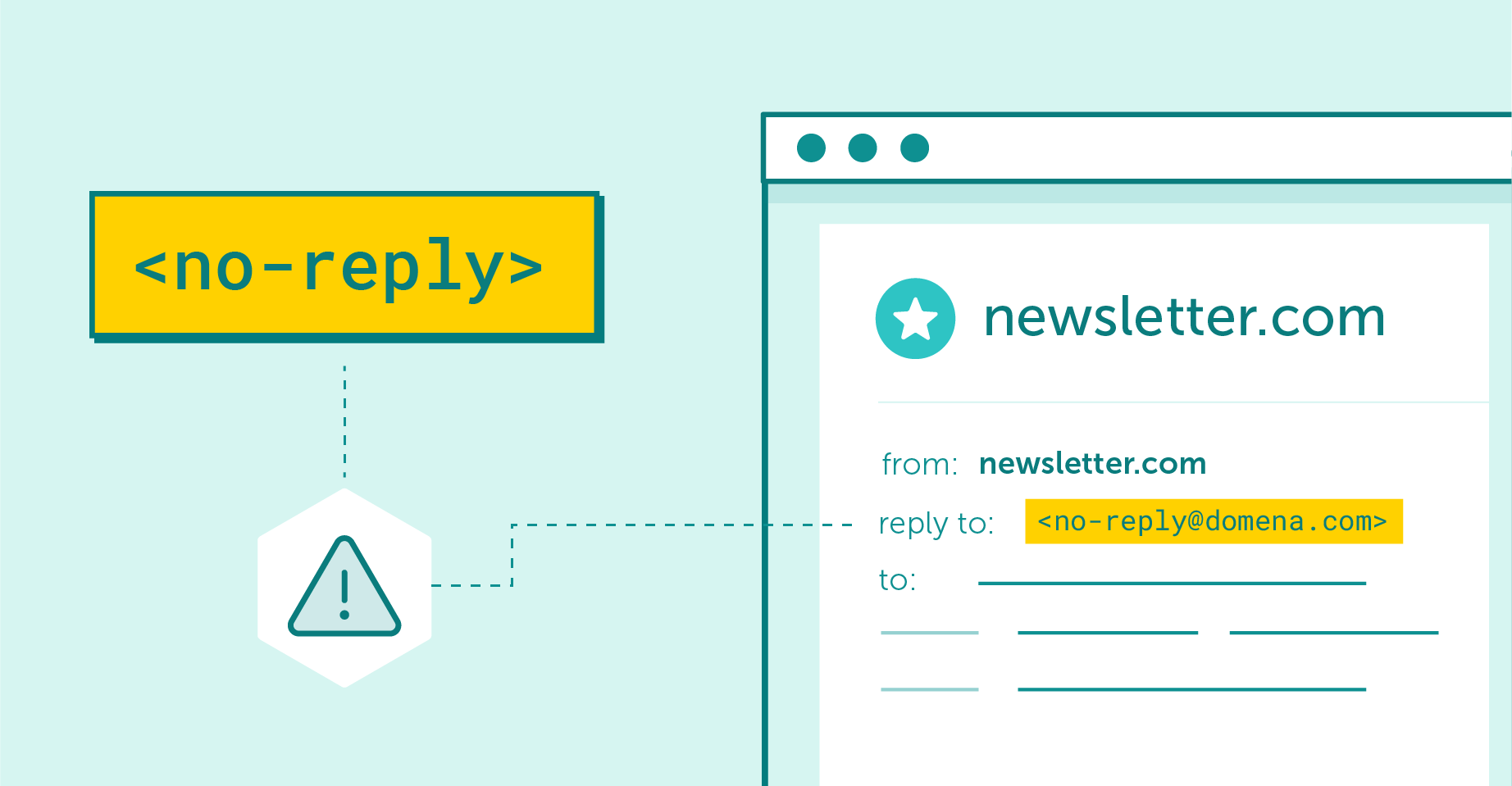
In addition, newsletters allow two-way communication, provided they are not sent from a no-reply address.
Additionally, email newsletters allow for two-way communication, provided they are not sent from a no-reply account. Here you can read more on why it’s best to avoid no-reply email addresses.
The days when email marketing required you to simply cram as much content as possible into your email are long gone. In order to stand out in today’s crowded inboxes and attract the attention of increasingly picky consumers, it’s important to pay attention to both the structure and the design of your email newsletter.
A good email newsletter is structured in a way that is easy to read and visually engaging. Typically, a newsletter will have a header at the top, followed by a body section that contains the main content, as well as a footer at the bottom. The header usually includes the sender’s logo, contact information, and a call-to-action that encourages the reader to do a specific task, such as clicking a link or filling out a survey.
The body of the newsletter should contain the main content, i.e. articles, news updates, and promotional graphics. This section should be visually appealing and digestible, with a clear hierarchy of information.
The footer of the newsletter needs to contain additional information, such as legal disclaimers, social media links, and an unsubscribe button.
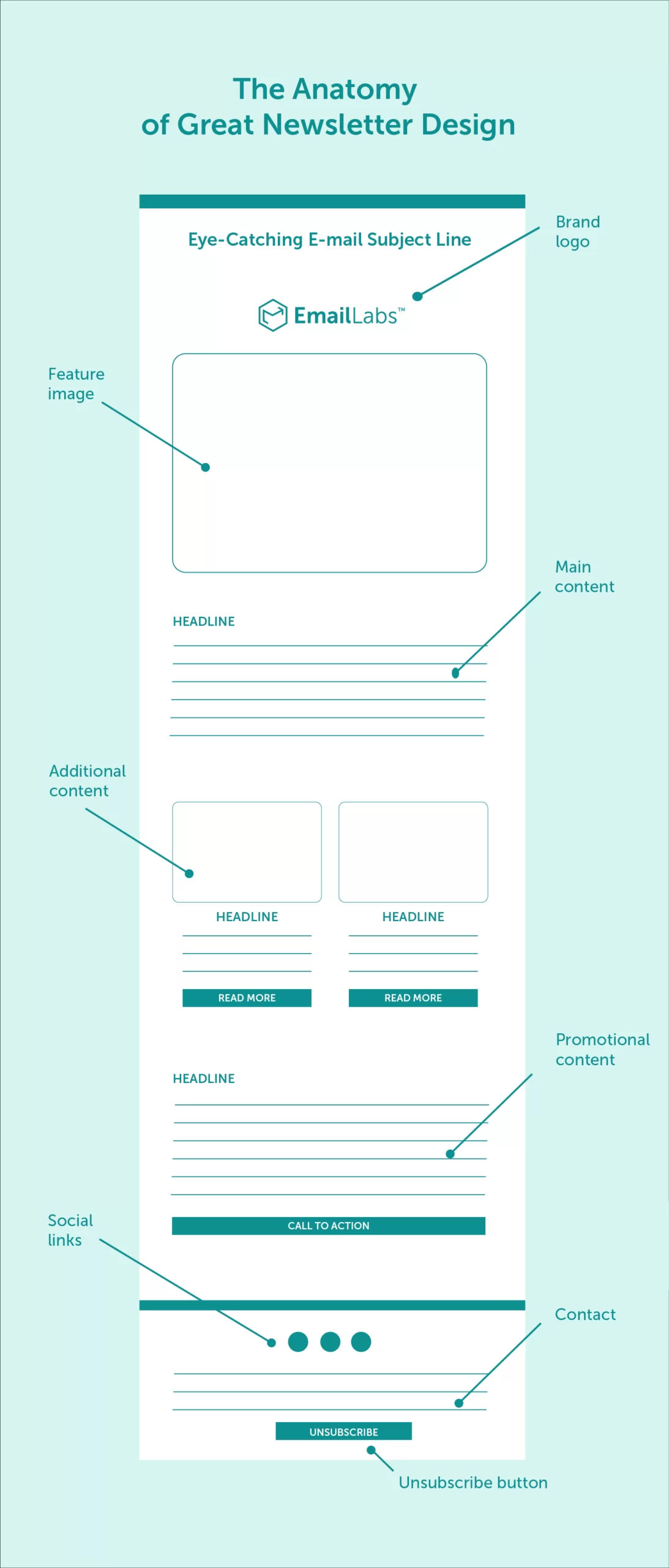
What should an ideally structured newsletter look like?
Email newsletters are an excellent way to engage with your audience and build a strong relationship with your customers. But what makes a great email newsletter? Below, you’ll find a few best practices and essential elements to consider:
The subject line is the first thing your readers will see when your email hits their inbox. It is important to make a great first impression and entice them to open your email. A compelling subject line should be clear and concise and give a hint of what’s inside the email (e.g., a summary of your recent blog posts or information about the free shipping offer). This is true for all of the newsletter examples shown later in the article.
It should also be attention-grabbing and encourage the recipient to open the email. Using action-oriented language, posing a question, or teasing the content can be effective in capturing the reader’s attention.
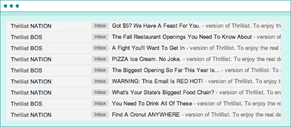
An example of Thrillist’s brand communication, which primarily relies on a brief and concise message.
Consistency is key when it comes to email newsletters. By choosing a regular frequency and sticking to it, you establish expectations with your readers, which can help build trust and loyalty.
You should consider your target audience when deciding how often to send your email newsletter. A daily email may be too frequent for most businesses, while a monthly email may lead to insufficient exposure. Creating a weekly newsletter is generally a good starting point.
Whatever frequency you choose, make sure to stick to it so your readers know when to expect your newsletter and can engage with it regularly.
A clean and visually appealing design can make a big difference in the success of your email newsletter. A cluttered or disorganized design is difficult for the reader to focus on, resulting in a lost email marketing opportunity as the potential customer exits the message frustrated.
Keep your design simple and consistent, using a limited color palette and easy-to-read fonts. Include eye-catching images or graphics to break up the text and draw the reader’s attention to key points.
Do you know what are the best fonts for writing emails and do they really matter?
Making your email newsletters more individualized is a great way to build a strong connection with your readers. Use data-driven personalization to create a newsletter that is more relevant to your audience.
This can include personalizing the email subject line, body copy, or even the content itself based on the recipient’s interests or behavior. Incorporating the recipient’s name or location can also help to create a more premium experience for the reader.
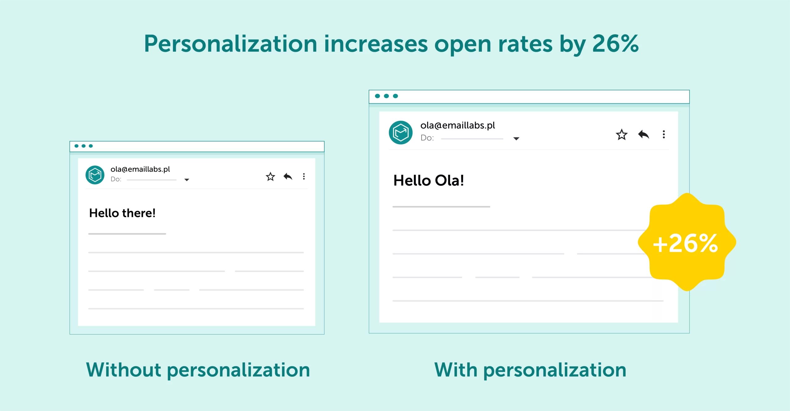
source: Experian
The content of your email newsletter is the main reason your readers will engage with it. Make sure that your content is informative, interesting, and relevant to your target audience. Provide valuable insights and information that they cannot find elsewhere.
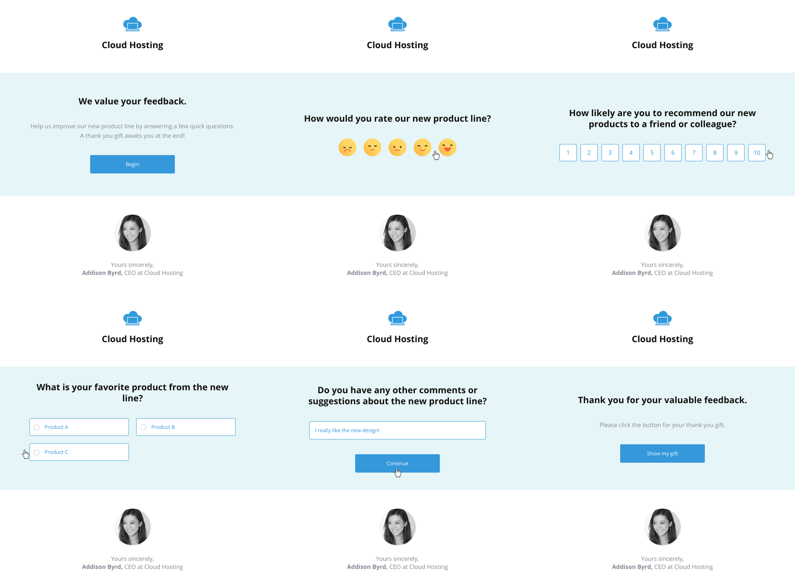
An example of an email newsletter with a survey that examines customer satisfaction
Include interactive elements like surveys or polls to keep your readers engaged and encourage feedback. Keep the content concise and to the point, using subheadings and bullet points to break up the text and make it easy to read. If you have user-generated content (e.g., favourable reviews), consider sharing it in your email newsletters – customers often rely on the opinion of others before buying.
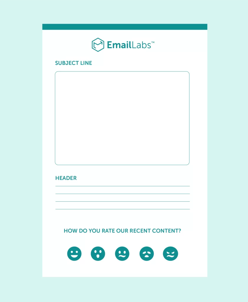
Example of an email newsletter with a survey
Your email newsletter should have a clear call-to-action (CTA) that tells your readers what to do next. This can be anything from making a purchase, registering for an event, or encouraging subscribers to follow you on social media. Most of the newsletter examples we discuss below use CTAs in one form or another.
Make sure that your CTA is prominently displayed and easy to understand. Use action-oriented language and create a sense of urgency to encourage the reader to take action.
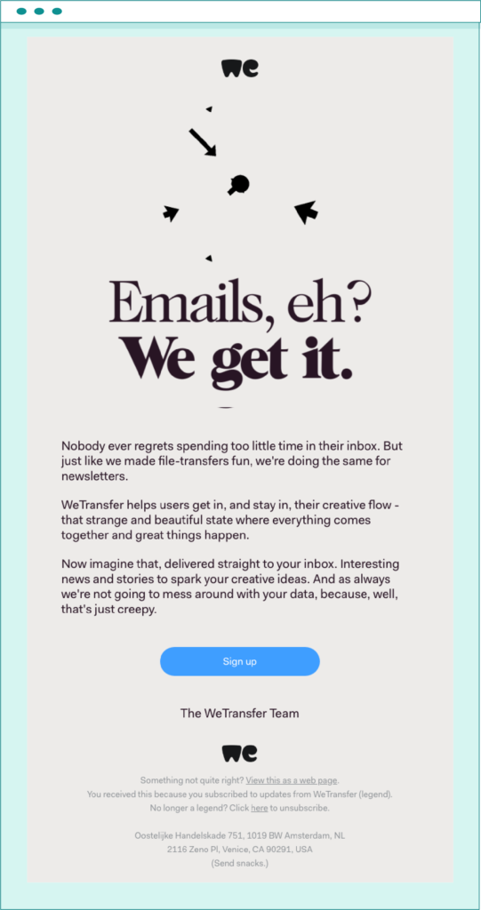
Example of an email newsletter with non-obvious message insertion
With the steadily-increasing use of smartphones and tablets to access emails, it’s crucial that your daily or weekly newsletter is optimized for mobile viewing. Make sure your design is responsive and that your content is easy to read and interact with on a smaller screen.
Keep the layout simple and use a larger font size for easy reading. Avoid using images that aren’t optimized for fast loading – if your newsletter takes too long to display its full contents, readers might get bored and abandon your email message.

Newsletter tailored to mobile devices where dark system mode is enabled
Test your email newsletter on different devices and email clients to ensure that it looks great across all platforms. Make sure it works perfectly on all of the major operating systems, including the previous versions of Android and iOS.
Maximize your email deliverability and security with EmailLabs!
Now that you know what to look for in a great email newsletter, here are some of the best newsletters that get it right. The examples you’ll see below come from all kinds of businesses – from news companies to e-commerce retailers and everything in between.
The Starbucks newsletter is a great example of how to execute an effective email newsletter campaign. The design of the newsletter is clean and simple, with eye-catching images of various coffee products that draw the reader’s attention.
When the recipients open the message, they may be greeted with a simple choice between two different offers that cater to their specific preferences: summer-oriented coffees or snacks for the fall.
The Instagram section presents various coffee types in beautiful environments, creating an urge to visit Starbucks. Customers want to feel like they drink the most premium product out there, and Starbucks knows it. The last section, one that markets the special anniversary blend, is also a great way to show that the brand is always coming up with new innovative ideas.

source: https://www.pinterest.com/pin/82050024445253809/
Samsung is one of the premier consumer electronics companies, and their email newsletter is a great reflection of that. The design is clean and modern, with a focus on images and visuals that showcase the company’s products. The various sections in this newsletter example highlight different products and offer exclusive deals and discounts that encourage the reader to make a buy.
The newsletter also includes a section that links to Samsung’s online stores, making it easy for the reader to purchase products from the company. Overall, the Samsung email newsletter is an excellent example of how to showcase a wide range of products in an engaging and visually appealing way.

source: https://newslettersearchengine.com/the-smartphone-everyones-talking-about-samsung-email-newsletter/
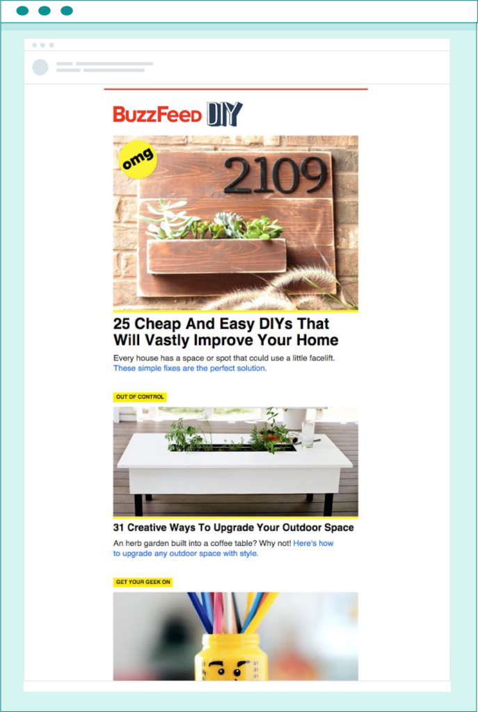
Buzzfeed is a news and entertainment website that is known for its listicles, quizzes and controversial news stories. What differentiates the Buzzfeed newsletter from other newsletter examples is its form – it is a great example of how to curate content from a website and deliver it in a digestible and encouraging format.
Buzzfeed newsletters often rely on teasers – short descriptions of the content that are designed to pique the reader’s interest. If the recipient wants to read the article in full, they have to click on the provided link, which drives traffic back to the website.
Such newsletters are most effective when written by professional copywriters that know how to craft short-form text that make people want to know more. It has to be well-written and engaging; otherwise, the whole concept falls flat.
source: https://in.pinterest.com/pin/483785184953017026/
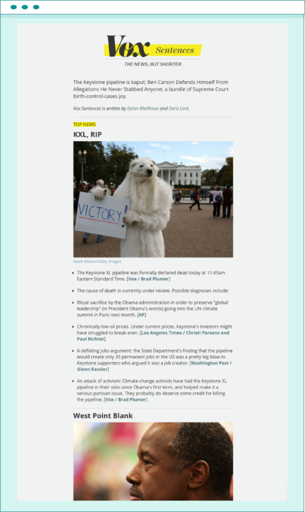
Vox is a news website that covers a wide range of topics, from politics to business and everything in between. However, some readers don’t have the time to read through all the stories on the website. That’s where Vox Sentences comes in – it’s a nightly email newsletter that delivers the most important news articles from all over the Internet in a concise and easy-to-read format.
The newsletter example includes a catchy headline and a few bullet points that describe the story. If the reader is interested in learning more, they can click on the provided link and read the full article on the specific website. This is a great way to keep people informed about the latest news without overwhelming them with information.
source: https://in.pinterest.com/pin/483785184953017026/
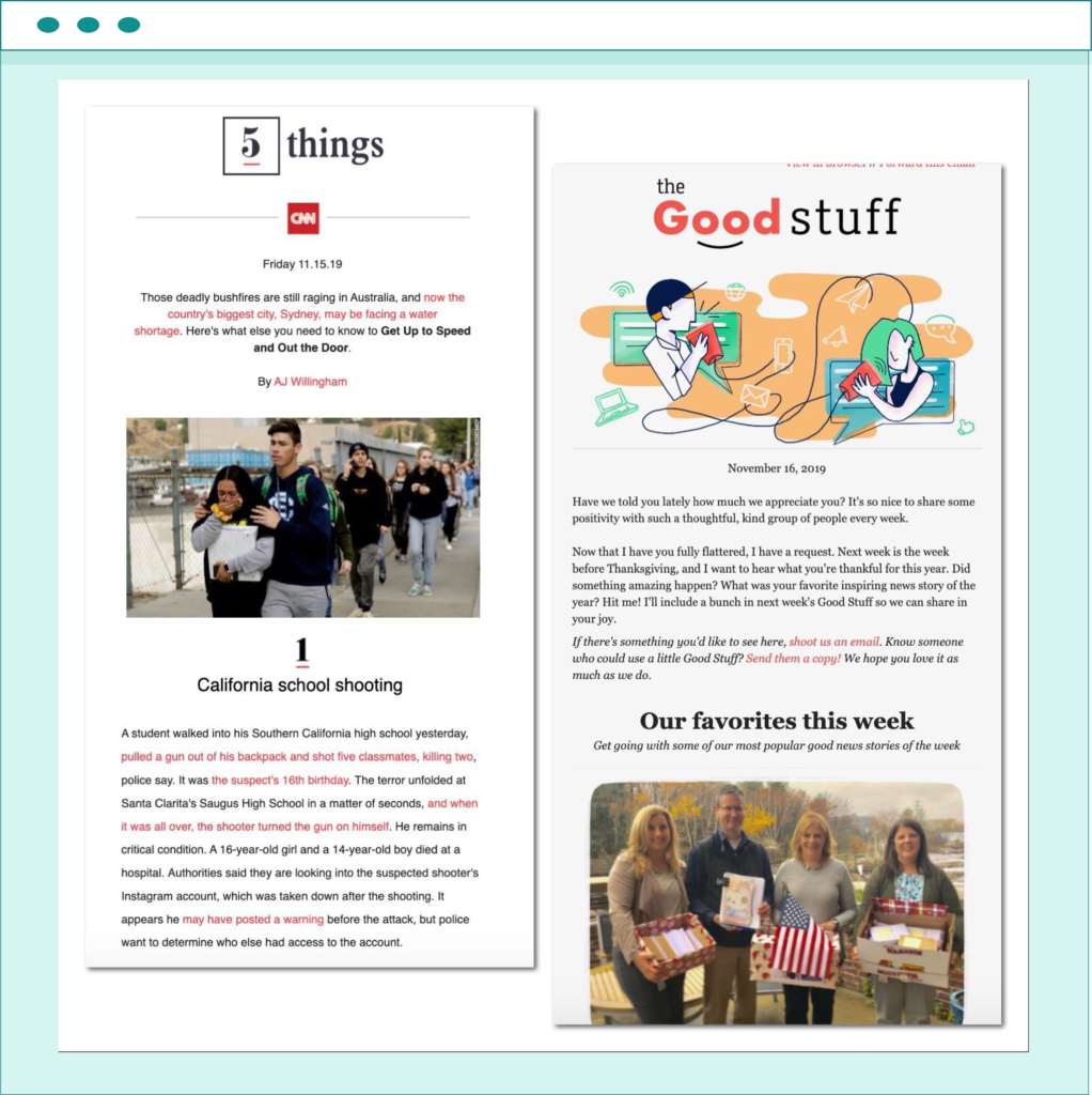
Continuing on with news outlets, CNN’s 5 Things newsletter is a slightly different approach to email newsletters than that of Vox. This newsletter example delivers the five most important stories of the day in the form of a listicle. Each story has a short description and is full of links relevant to the article.
The benefit of this approach is that the reader can quickly scan through the list and see if any of the stories are interesting to them. If they are, they can click on the link and read the full story. If not, they can simply move on to the next one. This newsletter serves as a great way to keep people updated on the latest news without taking up too much of their time.
source: https://twitter.com/saeed_ahmed/status/1195732285145911296
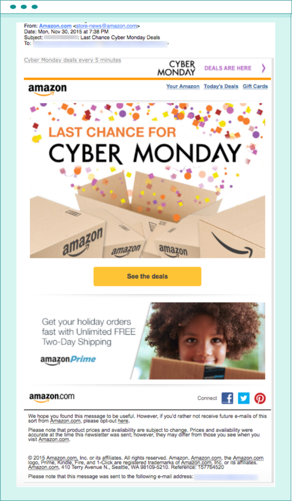
Amazon is one of the biggest e-commerce companies in the world, and its digital marketing efforts (including the email newsletter) must reflect that to help them maintain leading position. The design of the newsletter example is clean and modern, with a focus on images that showcase the available merchandise. The various sections offer exclusive deals and discounts that encourage the reader to make a purchase.
The newsletter often includes a section informing recipients of upcoming events e.g., Black Friday sales or freshly implemented new features that customers might find useful. As one would expect from such a big company, Amazon’s email newsletter is highly effective in driving sales and promoting the brand.
source: https://fulcrumtech.net/resources/amazon-email-review/
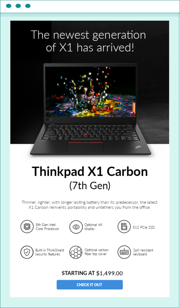
Just like Samsung, Lenovo is another consumer electronics company that needs to showcase a wide range of products in an engaging way. However, unlike Samsung, Levovo usually relies on a much more striking color palette in its newsletters. The design is still clean and modern, but the focus is on images and visuals that showcase the company’s products in a more creative way.
The various sections in the newsletter example often highlight different products and offer exclusive deals and discounts that drive the reader to make a purchase. Lenovo newsletters rely on tried and tested methods of displaying the biggest advantages of their products in informative points (e.g., instead of writing “long battery life,” they would say “up to 12 hours of battery life”).
If there’s a sale going on, Lenovo newsletters will usually emphasize the cost reduction. After all, consumers who are on the fence about buying a new gaming laptop might be swayed by seeing a “Savings $300” or “Up to 30% off” sign.
source: https://emailtuna.com/lenovo.com/1372830
National Geographic is a world-renowned magazine that covers a wide range of topics, from history to science, and is particularly known for its breathtaking and award-winning shots. The National Geographic email newsletter example capitalizes on relying heavily on beautiful images to drive the message home, resulting in one of the most captivating newsletter examples we have on our list.
The design of the first page often includes a large image with a short description and a call to action below it. The CTA asks the readers to subscribe, which is often given once they see the breathtaking image and the catchy headline.
The newsletter may also include a section that highlights the most popular articles from the website, as well as social media links.
If you have great visuals that you use in every blog post, make sure to use them in your email newsletters!

source: https://reallygoodemails.com/emails/special-moon-landing-offer-on-national-geographic
Email newsletters can be extremely effective in driving sales, promoting your brand, and keeping your customers informed about your latest news and updates. However, not all email newsletters are created equal. To make sure that your newsletter is successful, you need to make sure that it meets all the criteria of a great email newsletter.
The design should be clean and modern, with a focus on images and visuals. The content should be well-written and engaging to deliver value to the reader.
And finally, the newsletter should include a call to action (CTA) that encourages the reader to take some sort of action – whether it’s subscribing to your website, making a purchase, or simply reading more of your content.
Most of these points are easily visible in almost every newsletter example we’ve shared in this article. So make sure to take inspiration from them and create a newsletter that will be a valuable asset to your business.
And don’t forget to check out EmailLabs – we can make sure that your email newsletters reach the inbox of your subscribers in no time! Contact us now and take your email delivery to the next level!
We live in a world where your customers switch seamlessly between laptops, smartphones, and tablets. They navigate a complex digital ecosystem – checking emails, using mobile apps, and reacting...
We are delighted to announce that Vercom S.A., the company behind the EmailLabs project, has successfully completed the ISO 22301 certification process. This significant achievement underscores our commitment to...
EmailLabs, as part of the Vercom group, proudly announces its full commitment to aligning its ICT services with the latest cybersecurity standards. In response to dynamically changing regulations, the...
We are pleased to announce that MessageFlow, a product from the Vercom S.A. group, has received the prestigious CSA (Certified Senders Alliance) Certification. This recognition not only underscores the...
Modern email systems no longer treat the primary inbox as the default destination for every message. The final classification of an email is the result of a multistage evaluation...
Best practices, Maile marketingowe, Marketing E-mails, Transactional Emails
Mass email sending is a critical strategy for business owners, marketers, developers, and nonprofit managers looking to scale their outreach. Whether you are announcing a new product feature, distributing...
Best practices, Marketing E-mails
Customer feedback is the fuel for business growth, but gathering it effectively requires more than just a list of questions. Email surveys remain the most direct channel for understanding...
Best practices, Email Marketing, Pytania i odpowiedzi
Mail merge combines a template document with data to create personalized communications. This technique saves time by automatically generating individualized letters, emails, and labels without manual entry. What Is...
IT & Tech, Pytania i odpowiedzi, Technical
When an email travels from sender to recipient, it passes through several critical components of email infrastructure. At the heart of this journey sits the Mail Transfer Agent (MTA)...
Best practices, Deliverability, Google and Yahoo's Requirements, Pytania i odpowiedzi
The world of email marketing is constantly evolving, and leading mail service providers – Gmail, Yahoo, Microsoft, and Apple – regularly update their guidelines for senders. In recent years,...
Gmail, Google and Yahoo's Requirements
You might have noticed a new item in your Gmail sidebar recently – the “Manage subscriptions” tab, often flagged with a blue notification dot. While Google announced this feature...
IT & Tech, Pytania i odpowiedzi, Technical
Efficient email communication isn’t just about sending messages — it also involves integrating email functionality into your business systems and applications. Email APIs (Application Programming Interfaces) serve as the...
One of the most important yet often underestimated elements in shaping a company’s brand perception is the transactional email. In e-commerce, the design of such messages must be carefully...